

<
>


Get more info
Farmer
Farmer is one of the most successful cereal bar brands in Switzerland, with a very large portfolio of varieties. We redesigned the logo to strengthen the natural feel of the product, maximize appetite appeal and reinforce shelf impact. We also overviewed the colour coding to have a stronger relationship between ingredients and flavour. Different subranges have been launched, all using the best ingredients of the brand, reflecting Farmer’s natural character. Is there a better reason for getting up in the morning?


1 - 6
<
>


Get more info
Roland
Since 1939 Roland has optimised Swiss baking tradition. Their “double-stripe” brand and packaging were strong and recognisable, but also outdated and industrial looking. The new design reinforces the messages of quality and tradition and the health conscience character of the product. Roland: a brand at the heart of Switzerland’s wheatfields.


1 - 4
<
>




Get more info
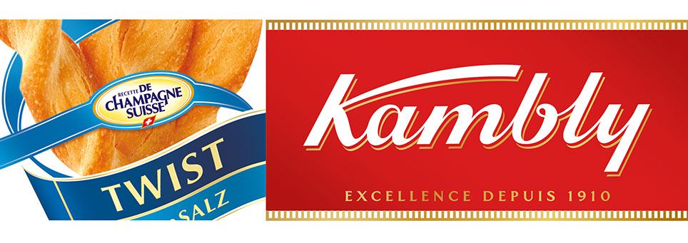
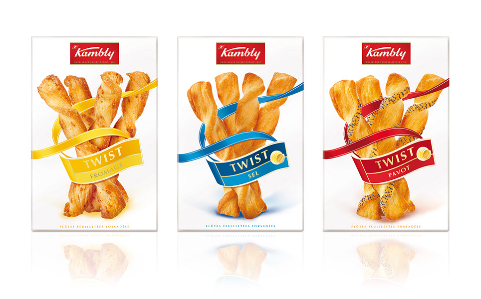
Kambly
Kambly is one of Switzerland’s most treasured brands. We redesigned their aperitif range to bring it into line with Kambly’s premium positioning. All elements have been designed to convey a sense of elegance. The overall feeling is one of “festive refinement”

Get more info
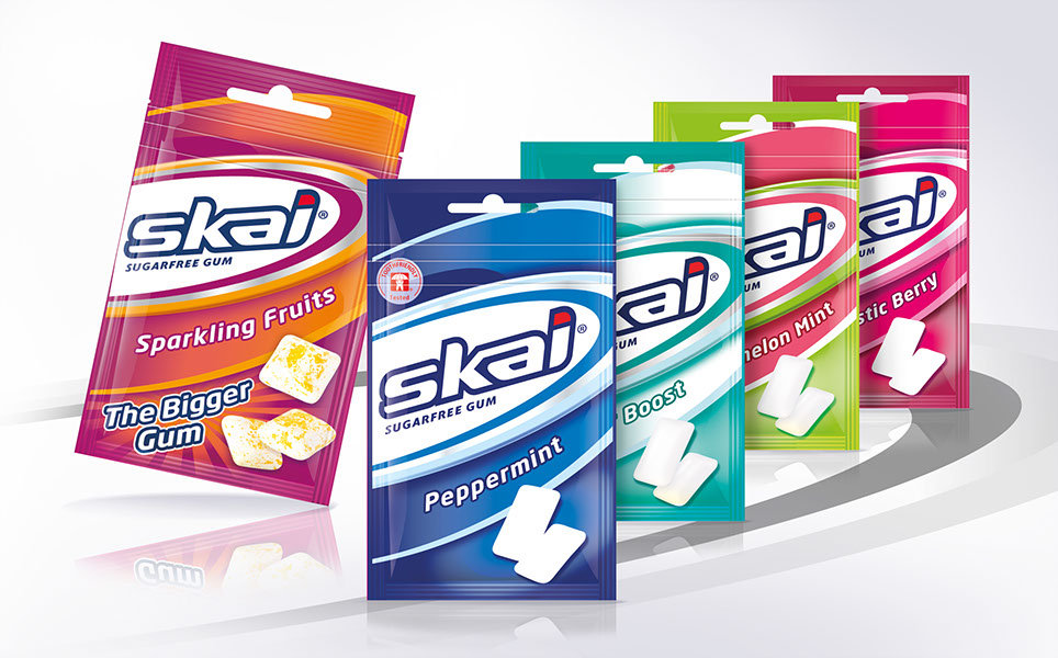
Skai
One of Switzerland’s most famous brand of chewing gum has been managed
by Paragon for over 8 years. The range was relaunched in 2008 to become an affirmative and positive brand.

Get more info
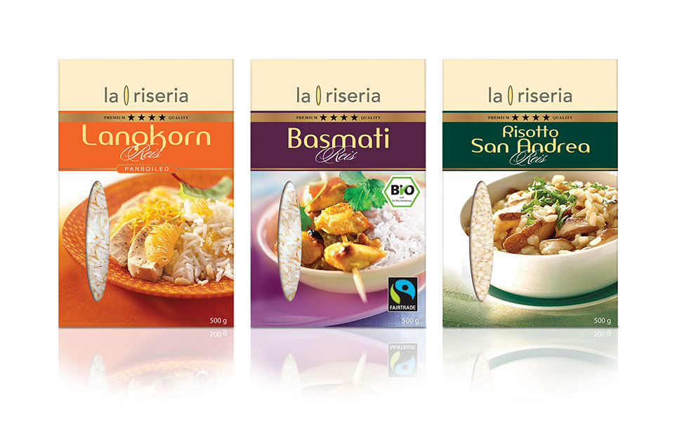
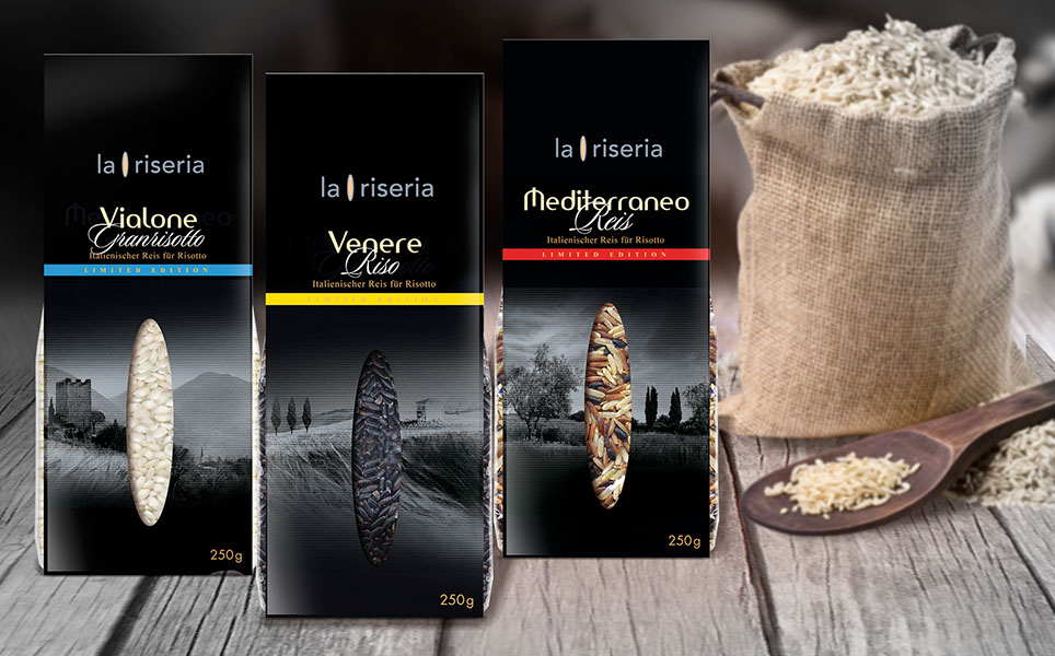
La Riseria
This ultra-premium range uses the “rice grain” diecut (stemming from the la Riseria brand) as a focus, communicating the product in its purest form.
© PARAGON DESIGNWORKS 2017